Friday 4 April 2014

Evaluation Task 4

  • Blogger
  • YouTube
  • Gimp2
  • FinalCutPro
  • Camera - Sony ...
Blogger was used as all of the students HUB for all of our progress throughout the entire year. This meant that from our planning through to our final product and evaluation tasks such as this, would all be found in this one location. This makes it easy for the students to be able to refer back to previous work and to collect previous data from the past year.

YouTube was used as a location for both publishing our final products and also for research. Youtube allowed us to look at trailers that fitted the same genre as we were going for and to be able to take inspiration from shot ideas, camera angles, soundtrack and character types. Allowing us to make reference back to these trailers as examples as research that we have done into our genre. Later when publishing our products this site allowed us to embed our final product into a blog post and post this on to our pages of Blogger.

Gimp2 was the photo editing software that we used to edit and create our film poster and magazine covers. This software allows the user to manipulate the image in any way that they need. When creating our poster there were a few things that we found that we didn't like about the image, like the colour. But this was easily altered using the programs colour editing, meaning we were able to pick out the different sections that we wanted to alter and change them to what we felt stood out more. When it came to a week before the deadline for our work, it was pointed out to me that within our poster it looked like Matthew Burges' character was the main focus of the poster, upon looking back at the image this became apparent to us. This was a simple thing to alter as all that was needed was for me to get another image of the background without the character

Final Cut Pro, This software is the most recent update from Apple of what used to be the industry standard in video editing. The update however lost many features that made the software a good editing tool. the similarity between final cut pro x and imovie are almost identical just allowing you to tweak individual aspects such as colour gradiation etc. Although the software felt limiting there was no other option as i had already updated the machine from the previous final cut. 
For the first time using final cut pro x i referred to lessons online regularly to be able to understand the software.Some audio EQ is also available, but we used dedicated software for creating an editing the soundtrack. During the editing process many of the available features offered by Premiere Pro were used, we thought that of we are going to use the best software, why not use as many of the features as possible, within reason of course. The actual editing process went very smoothly due to the software's well thought out and laid out design, the timeline at the bottom, a preview screen to view the changes made to the trailer and the effects window where all the effects are changed and managed.

The main camera we used was the Sony Nex-7. The reason being that i have heard many different reviews of this camera and the other option my nikon D7000 is a bulky camera that is not easy to get some of the running shots or high angled shots.


Evaluation Task 3


  • Close up on Micheal
  • Soundtrack - contrast, music fades towards end fitting in to clip that was being shown, consideration of other soundtracks
  • Camera being zombie (Final Scene)
  • Typography - use of text in between shots, text supporting the clips shown (justify why they were used), consistency (He's changed/The world has change)
  • Use shot from trailer before Company
  • Conventional, revealing some plot but not giving too much away
  • Chaos within the scenes gives the audiences something to think about and gives them questions
  • Reality of ammo. Limited ammo, teenagers using guns, ect
  • ADR quality - White noise, background sounds, difficult to sync the sound with lip movement
  • One continuous shot, could have used a series of fast cuts to show the chaos within the scenes, the one long clip seems to slow and drags on
The use of the close up on Micheal Bird towards the beginning of the trailer was well received. They found that this allowed them to get a close look into who the characters were so they were recognizable within the trailer. But this was not kept consistent, Micheal Bird and Matthew Beacham are the only two characters who get a close up of their face.

The soundtrack received a mixed view, on one hand people thought that it worked well as a contrast, the slow, solemn playing over the top of clips that showed high emotion and intensity. While others thought that this didn't work as well because it was too much of a contrast from the clips used within the trailer making it hard for them to understand the trauma and pain that the characters were going through. The reason that we chose to use the soundtrack how we did was because of the intense contrast that it provided. The music is used more to physicalise the emotion that Jay is feeling, rather than the intensity of the scene being shown. As shows in previous blog posts, there were many different considerations for soundtrack of our product. Starting off we wanted something that did show the high impact and intensity of the scenes that were being shown, we wanted a rocky guitar and drum beat to give the trailer that added aspect of a fast passe beat and heavy guitar riffs.

Another aspect that was focused of within the talk was our use of the final clip using the camera as a first person view of a zombie. This had positive as they found that this played with the idea that our trailer never did use a full view of zombies, only ever short clips that either only showed their shadows or the image being slightly distorted, making it harder for the actors to be seen by the audience. The main concern of this clip was the fact that the reality of the shot meant that the characters were just running back and fourth  from nothing.

For the Typography, the text used was there to once again provide a contrast to the intensity of the scenes used within the trailer. The text used was downloaded from the internet because we found that it provided the plain look that we were looking for. We wanted something that looked similar to the text used on the news channel, but also different to show the change that the world has gone through. This gives the idea that the characters do still have some form of way to communicate and find out news about other areas of the country, but is hard to locate and use. This is shown by all the text being directly linked to our main character Jay, as he is having someone/something talk about him and tell his story, while he has no idea of there being anyone else out there. The words that we chose to have appear were chosen because it emphasizes our theme of isolation, saying such things as 'He's alone' giving the audience that direct knowledge to this characters situation. But this is later contradicted when he can be seen with two different groups of survivors. This provokes questions to the audience they want to know who these people are and how they fit in to the story. The reason that we felt that the text could still be used was because we found that idea of Jay being alone didn't have to apply to his direct physical world, but rather he has lost his family and his friends, meaning that his world is no longer the same and he is alone with his memory's of the past, as there is no one within this new world that knows his story.

Another aspect that was brought up within our talk was the fact that we chose to use a shot from the trailer before having the company logo appear within the trailer, this plays into our film as logos were something that people cared about in the past and now in the age where technology has died no one really cares about what things are coming from, just focusing on getting what they need. So by having our logo appear after a short clip it links this idea that the past is going to be a focused subject within our film.

Our trailer did stick to the conventional aspect in the concept of revealing story line. We wanted to allows aspects of the plot to come through without giving too much away as this unknowing is what would bring the audience to see the film. We wanted the audience to understand some of the characters within the film and some of the relationships that are going to be formed within the film itself. Plus some of the trials and tribulations that our main character would go through within the film.

Our film sticks to the idea of reality. We wanted a film that applied to the idea of survival and the high risk of being found. This means that the characters within the film would not want to use weapons as the sound that they create would attract unwanted attention, which could cause them to get into increased amount of danger. Also adding to this is the idea of limited ammunition. Within some film or TV shows, such as The Walking Dead, the ammunition seems to never run out and weapons are able to fire mass amounts of bullets without needing to reload. For us this takes away from the reality of the film. This meant that we were eager to move away from this idea, showing the characters having to make weapons and such from things that they have found, as people most like would if this was a real situation. Feed back given told us that this was a good choice as it added to the trailer and gave the audience the idea that this is going to be a film where people are pushed into a last stand moment before they risk using a loud weapon such as a gun.

One main note that came up within the feedback session, that both me and Ryan noticed as well was the quality of the ADR. The sound quality from the original footage was too quite to be heard, and had too much background noise within it to be able increase the volume of the footage. This meant that we needed to re-record the sound to later put in over the clips. This proved more difficult than we thought as it was difficult to match the sound exactly to the lip movements from the clip. This meant that we were unable to use that section of the ADR and so with little time left before the deadline of the project we decided to ditch it and move on. On the other hand we were able to get some ADR which did sync up to the lip movements. But because the actor that we used for the visual clip was unavailable we needed to use someone else that could do his voice.

Finally we were told that we use too many long lengthen shots. That because of this at times within the trailer showed these clips the audience began to turn off and stop paying attention. It was said that this could have been avoided by cutting those longer clips into a series of shorter clips that could have been quickly cut between to speed up the longer ones.

Tuesday 1 April 2014

Evaluation feedback

You have made a start on your evaluation, with work on task one (although you should add in how you have conformed to/subverted the conventions for each point). You have applied theories of audience. You must post regularly - there has been nothing uploaded since 13th March.

Targets:
Titles of posts - make sure all are titled 'Evaluation Task x'
Evaluation task 3 - re-upload the audience feedback for your finished trailer - you should sum up what you have learned (positive and areas to develop) in your analysis
Evaluation task 2 - record a voice over/interview style footage where you discuss how the three tasks combine effectively to create a marketing campaign
Evaluation task 4 - Upload images of all technology used and explain what you learnt about it/from using it. The software you used to create your poster/magazine cover, blogger to record your work, YouTube to view other trailers, the camera etc. Make sure all of this is discussed.
Remember to also upload any written responses you complete for exam preparation to add to your evaluation

Thursday 13 March 2014

Evaluation Task 1


Our first opening shot shows the audience a sky, the reason that this was chosen as a first opening shot was because it gives the audience a pleasant sight that they can all recognize and appreciate. This pleasant feeling that is given off from the sunny sky is a complete contrast from the rest of the trailer. Giving it that sense of juxtaposition, allowing the audience the chance to relax and then to give them something that shows the exact opposite emotion from what they are currently feeling.
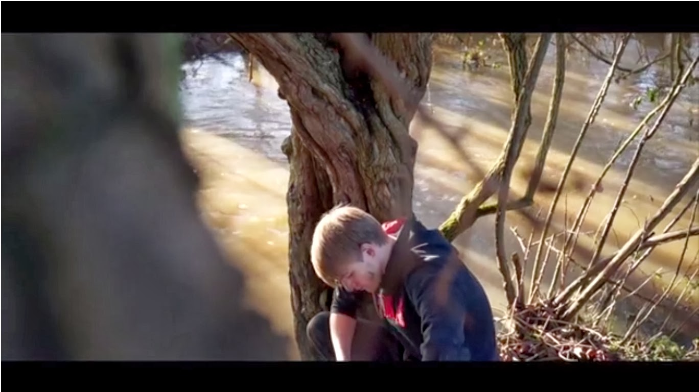


This shot was chosen as it allows the audience to establish a main character as this character is the first one that they see. Another reason is it allows the audience to feel that this character has been effected by the events of the apocalypses. It is shows by a high angle shot and the fact that he is crouching down while looking down at the ground. The high angle show allows the audience to feel above the character in status meaning that they understand the emotion that this character is feeling. The crouched down stance gives the audience the idea of giving up, the idea that he is crouched make the audience question why he is like that and what could have driven him to allow himself to be that 'relaxed/calm' about a extremely deadly situation, also supported by him looking down to the floor as his guard is now completely down and he is vulnerable.
Accompanying this is a slight over the shoulder shot, as seen on the right hand of the screen there is a person standing there looking over the main character, this also allows the audience to ask questions about the scenario that they are watching. Why is he there? is he forcing the character on screen to lower his guard? Who is he to the character on screen? It also adds an ominous feel to the trailer as you can't see the face of this person, leaving the audience in ignorance.
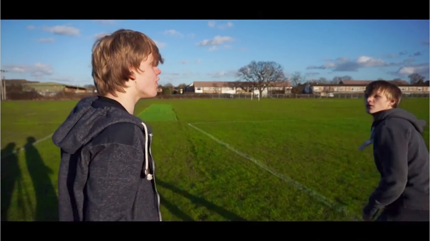


This shot was chosen as it allows the audience to begin to understand the different relationships that the main character has formed with other people. The confrontation shows that there are still people in an apocalyptic world that you still cannot trust. Both characters are teenagers, this means that the audience will get the feel that not only adults have been effected by this tragic even, but also the fact that no adults are anywhere to be seen leaves the audience knowing that they characters have been forced into a situation in which they all have to take responsibility of they own actions and the ones that they care about. A situation which many of them may not have been ready for.
Unfortunately for this shot the shadow of the camera man and camera can be seen within the background. Because of the extent of filming done and the time left for the project to be finished we have decided to leave this shot how it is and to try and find a way of removing this shadow. Trying to overlay another section of the shot where the shadow can be found.


Contrasting to the previous relationship that the audience saw Alex, the main character, in this allows the audience to see that not everything with a world of chaos and destruction has to be filled with trauma and grief. Other, friendlier relationships can be formed with people and, as shown by this shot, love stories can be forged from within the pain of loosing your loved ones. The pleasant scene is accompanied by a shot of clear sky and the sun coming through the gap between the characters. This shows that from this scene when these two are together they feel that nothing is wrong with the world anymore and they can just enjoy themselves in the presence of the other. But this does not mean that this will be a strength. This could lead the characters into dangerous trials ahead if they allow themselves to get carried away with each other as it could result in devastating outcomes.
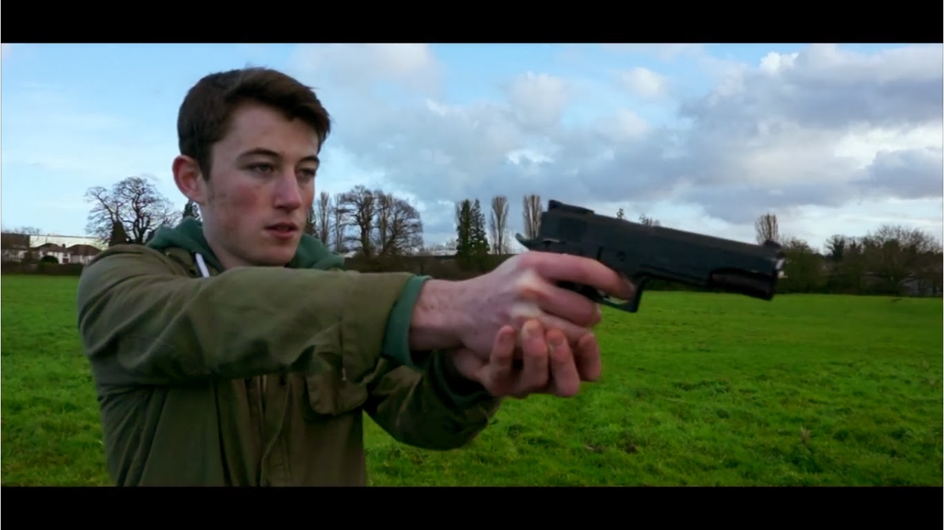


This shot shows Sam pointing a gun off screen, this shot was chosen once again to get a sense of the unknown, when planning to make Eraze we wanted to trailer to work in a way that didn't rely on the zombies being in shot. The threat of the zombies is still there, but it's more about the awareness and fear of the unknown that we wanted to play around with. The costume used allows the audience to relate to the characters as they see that Sam is in his late teens. Once again enforcing the idea that people have been forced into growing up faster and taking more responsibility within their lives and the lives of the people they care about. The gun allows the audience to understand the way that the world has deteriorated, law is merely a thing of the past, and now kids are having to get hold of weapons and learn how to use them, otherwise they will be easy pray. The idea of adapt or die comes into play.
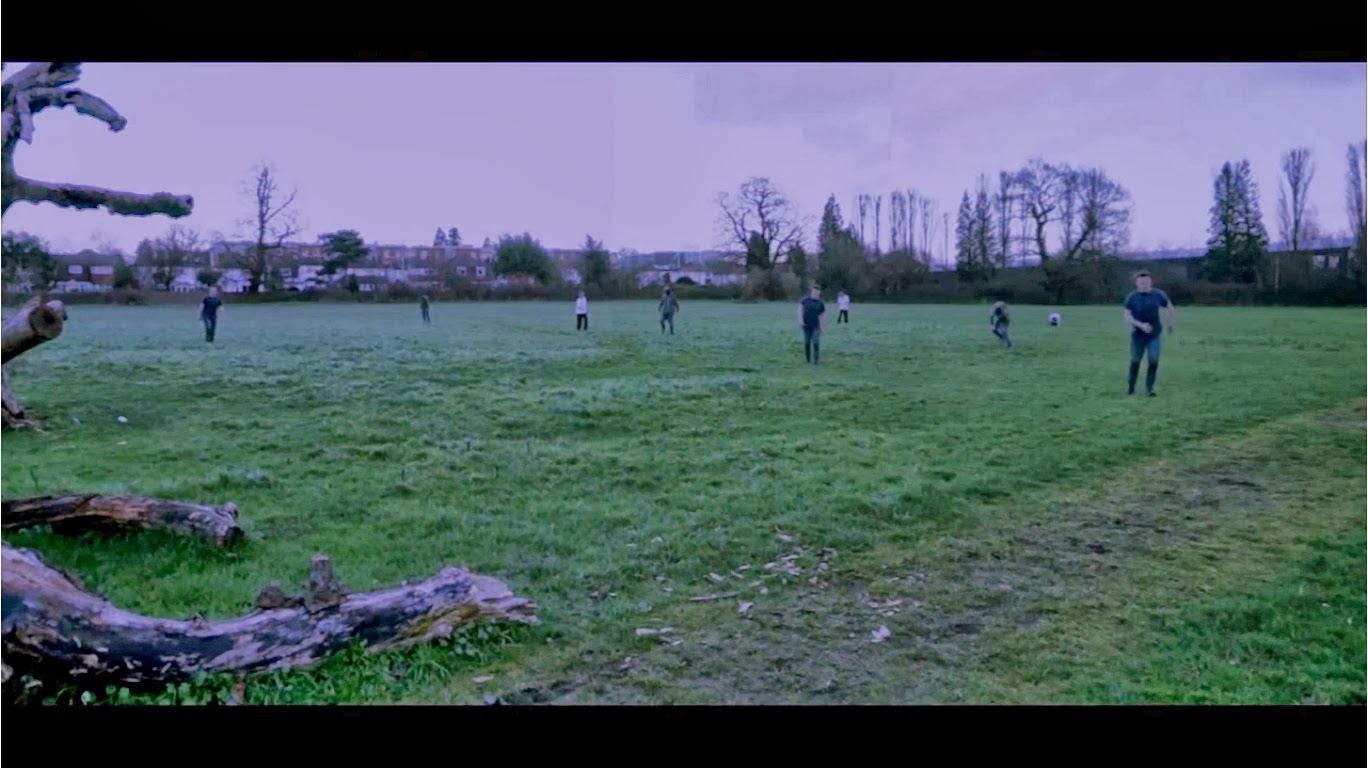


This is the first and only shot in which the audience get a clear view of the zombie threat. To create this show we filmed three different shots and merged them together in editing, this means that were were able to create a larger amount of zombies with minimal actors. The reason that this was needed was because it was difficult to get a hold of people who were able to come and film with us as events kept popping up and actors kept cancelling. So taking this into account we made due with the people that we had at the time and created this shot. When in editing we found that the shot didn't fit the dark feeling that we had hoped it would, because the sky was a bright blue and the sun was shining down to the grass making everything seem quite pleasant. Because of this we altered the colour of the clip, waking the sky and ground darker while adding in a slight grey tone to them creating a fog like illusion.
This shot was chosen as we felt that even though we wanted to create a trailer that didn't rely on actual clips of the zombies we felt that we did need to allow the audience to put an image to the threat that the characters were going to be facing. When it came to creating the 'zombies' we wanted to take our own spin to it, moving away from the whole, decaying bodies and blood filled mouths. We wanted to make the zombies look close to humans but with slight differences, our main difference was the way that the infected walked, we took on the aspect of how people walk or move when they are highly ill, making it look like they are slightly in pain when they move.
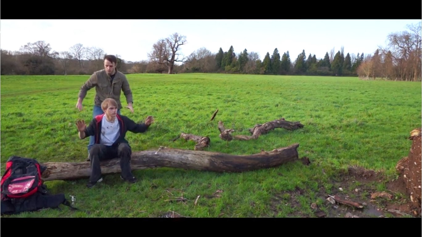

This shot allows the audience to get the idea that within a world in which law is a thing of the past, zombies are not the only thing that people are going to have to worry about. There are other people who are going to be trying to survive and feeling that they cannot trust anyone, or who feel that it is just easier to just kill the people they come along and take what they need from the dead victims. You will not always come across a group of people who will be willing to let you 'pass through'. Here Alex has had a gun pulled on him, from off screen, which has forced him to put down the weapon that he was making. Not knowing that there was someone coming up behind him to pull him to the ground and stop him from moving. Once again enforcing the idea of the fear of the unknown, Alex has no idea that he is about to be pounced upon by other character, all he is focused on in the man with a gun in front of him.
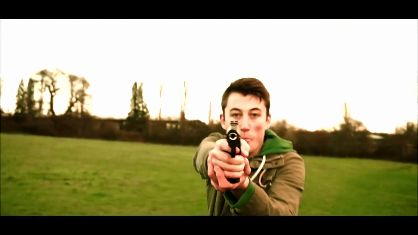


Here the attention is fully focused on Sam's character. The gun pointing at the camera allows the audience to understand that they are watching this clip through the eyes of the threat that the group are faced with. The blurred background gives the scene a feeling of focus, the zombies care not for what is around them, merely their target. Once they have sighted a possible meal they will focus all their attention onto that single target. This gives the 'zombies' that added feeling of humanity to them. We want the infected to have a sense of humanity as it make tasks such as killing them a little harder. The infected have small imprints of their past memories, an example of this would be finding a friend that has now become infected, they would look at you as if they knew you, but this wouldn't faze them when it came to killing you.
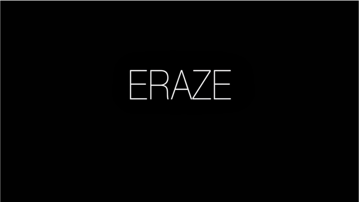


After a shot from the pistol in the previous screen shot the title would flash up, we felt that the title would be best found towards the end of the trailer as it allows the audience to get an all around opinion about what they are going to see within the film before they make any decision about the film. This allows them to see that this film is going to be more than just people running from building to building killing zombies, there are also going to be some solid story lines that they can follow accompanied by different character relationships that will keep each scene spiced up with action, thrills and drama.
For the design on the title we went with a basic and clean text, allowing the audience to get a clear view of the name of the film. Also adding a contrast to the chaos within the film and fitting in with the films theme of looking and reminiscing on the past when everything was easy and taken for granted. 

Wednesday 26 February 2014

Eraze - Trailer

The trailer that we have in this post is still needing some ADR before ewe can have it at a place that we believe it is finished.